
Executive answer
Canada’s Benefits Finder narrows federal programs using topic, audience and province filters.
The problem: A user selects “Starting a family/Raising children,” “Parents/Legal guardians” and Alberta. The first result requires a disabled or deceased CPP contributor. The second requires a child with a disability. The third benefit closed in 2024. None of those conditions was entered, and broader active programs appear lower on the page. The user therefore cannot tell which result is the most credible next step without opening the cards one by one.
The recommendation: First, remove or clearly separate closed programs. Then divide the remaining results into “Start here” and “Also consider if this applies.” On every card, state why it appeared and name the important condition the finder has not established.
The decision consequence: The finder successfully reduces 157 records to 11. But if users must investigate several dead ends before finding an actionable program, it has shortened the catalogue without shortening the decision.
Independent public-material review. Violet reviewed the publicly accessible English-language Benefits Finder on August 8, 2026. Violet was not commissioned by, and is not affiliated with, the Government of Canada. We did not observe user research, service analytics or internal ranking logic. The interface observations below are documented; the diagnosis and redesign are hypotheses to test.
The proposal at a glance
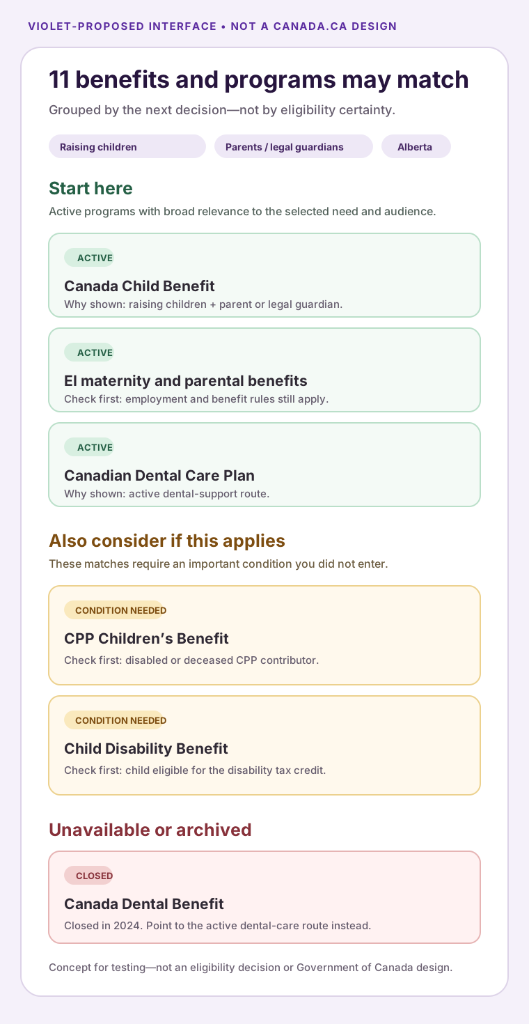
The recommendation is a status-aware hierarchy, not an eligibility decision. The concept below keeps every relevant match visible while separating current starting points, conditional possibilities and unavailable records.
That hierarchy is only justified if the observed list treats unlike result states alike. Here is the path we reproduced.
The workflow we reviewed
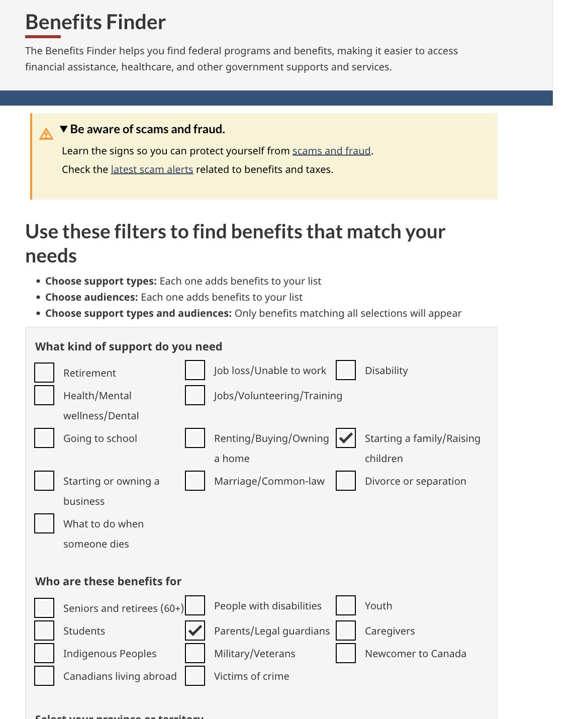
We selected three ordinary filters without pretending to represent a real applicant:
- Support: Starting a family/Raising children
- Audience: Parents/Legal guardians
- Province: Alberta
The finder explains that selections within a group add results, while choosing both a support type and an audience returns benefits matching both. The province selection links to provincial services; the listed results are federal. (Canada.ca Benefits Finder)
The visible path is:
Broad need + audience + province → matching records → flat list → open each record to test relevance
That path returned 11 results out of 157.
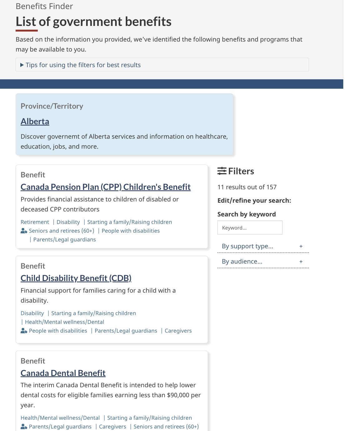
The reduction from 157 to 11 is useful. The remaining question is whether the order helps a parent recognize the best next step.
The exact problem, in one screen
The first result was the Canada Pension Plan Children’s Benefit, which applies to children of disabled or deceased CPP contributors. The second was the Child Disability Benefit, for families caring for a child eligible for the disability tax credit.
Both legitimately match the selected tags. Neither condition was supplied in the filter path.
The third result was the interim Canada Dental Benefit. Its card described help for eligible families earning less than $90,000. The linked government page, however, identifies that benefit as closed and states that it covered dental care received through June 30, 2024. (Canada Dental Benefit — Closed)
The active Canadian Dental Care Plan followed it. Broader programs such as Employment Insurance maternity and parental benefits and the Canada Child Benefit appeared farther down the list.
This does not make the specialist results wrong. It makes the hierarchy hard to interpret.
The interface has answered, “Which records share these tags?” The heading—“benefits and programs that may be available to you”—can sound closer to, “Which programs are plausible next actions for your situation?”
That small shift from record-level match to person-level relevance is where trust can leak.
A safer visual hierarchy
The redesign does not require a predictive eligibility engine. It requires a more explicit path:
Matching records → active-status check → general or conditional group → why it appeared → optional refinement → next action
1. Apply a freshness gate
An active discovery tool should not present a closed program like a current opportunity. Remove it from the default list, label it prominently as closed if historical access still matters, and point to the successor program where one exists.
This is the first fix because no wording can rescue an unavailable next step.
2. Separate starting points from conditional possibilities
Instead of one flat list, use two visible groups:
- Start here: active programs with broad relevance to the selected need and audience.
- Also consider if this applies: programs requiring an unstated condition such as disability, a deceased contributor, military status or a particular income and insurance situation.
The narrower programs remain discoverable. Their conditions stop competing invisibly with general programs for attention.
3. Explain why every result appeared
A result card could add two short lines:
Why this appears: You selected “Raising children” and “Parent or legal guardian.”
Check first: This program is specifically for children of a disabled or deceased CPP contributor.
The current topic and audience tags describe the catalogue. The proposed lines interpret the match for the person looking at it.
4. Offer one optional refinement
After showing results, ask:
Would any of these help us put the most relevant programs first?
Options might include expecting or recently welcoming a child, caring for a child with a disability, looking for dental support, or “not sure—show everything.”
This preserves anonymous, low-friction discovery. It also avoids turning the finder into a long form before users see any value.
Do not improve precision by hiding help
Public benefit discovery has an important asymmetry: an irrelevant result costs time, but a missing result can cost meaningful support.
That is why Violet would not simply suppress every program whose full eligibility has not been established. The finder is appropriately cautious when it says programs “may” be available. It also offers filter guidance and labels the results experience as beta.
The better design makes uncertainty legible:
| Current ambiguity | Proposed signal |
|---|---|
| A card appears in the list | Why it matched the selected filters |
| A specialist condition is buried in the description | A visible “This may fit if…” line |
| Active and closed programs look alike | Status and application window before the title |
| All matches share one hierarchy | “Start here” and “Also consider” groups |
| More precision requires manual searching | One optional, reversible refinement |
The aim is not fewer results at any cost. It is fewer unnecessary openings before a useful next action.
This is consistent with Canada’s own design posture
Service Canada says the Benefits Finder is in beta and describes work to improve search, filtering, summaries and the ability to refine results. Its published research notes that people wanted to edit responses without restarting and were confused about the relationship between federal and provincial benefits. (Service Canada Labs: Benefits Finder)
The Government of Canada’s Digital Standards call for services that are simple and trustworthy, designed with users and improved frequently. (Government of Canada Digital Standards)
This review therefore does not argue that the team ignored user-centred design. It identifies a bounded question for the next iteration: does the result hierarchy help people distinguish a possible record match from a credible next step?
What to measure
A useful test would compare the current flat list with the grouped, status-aware version. Measure:
- time to the first active, relevant program;
- openings of closed or clearly inapplicable results;
- use and reversal of optional refinements;
- successful handoff to an eligibility or application page;
- whether important programs become harder to discover for any group;
- confidence in answering, “Why did this result appear?”; and
- return-to-results behaviour after a dead end.
The redesign should lose if it makes the list feel cleaner while causing people to miss support.
What would prove Violet wrong?
The hypothesis would weaken if users of the current list consistently reach an active, relevant program faster than users of the grouped version—or if the proposed hierarchy causes people to treat “Start here” as an eligibility decision and ignore important conditional programs.
It would also weaken if the closed-benefit card serves a documented user need that outweighs the confusion risk and is already understood as historical.
Those findings would favour a different intervention. The point is to test the transition, not defend the redesign.
The executive decision behind the screen
A catalogue answers, “What exists?” An eligibility system answers, “What do you qualify for?” A useful finder sits between them.
Its job is not to pretend certainty. Its job is to make the remaining uncertainty easy to understand and inexpensive to resolve.
For a public-service finder, onboarding path or decision interface, Violet can review the visible journey, identify the first unsupported transition and design a bounded test. Start a focused interface audit or discuss a larger service journey.